Redesign of the Matching Core
From Profile to Decision
What is Pazz?
Pazz is a creative networking platform for the film industry. It connects filmmakers, enables project realization and helps find the right team for new productions. The core of the product is matching, but matching only works when profiles are complete.
The Challenge
The more Pazz grew, the clearer the structural problem became: Users were not filling out their profiles. Not because they did not want to, but because the platform gave them no visible reason to. Searchers saw empty profiles and left. Profile owners saw no reaction and continued to maintain nothing. A classic cycle of missing feedback and declining trust in the platform.

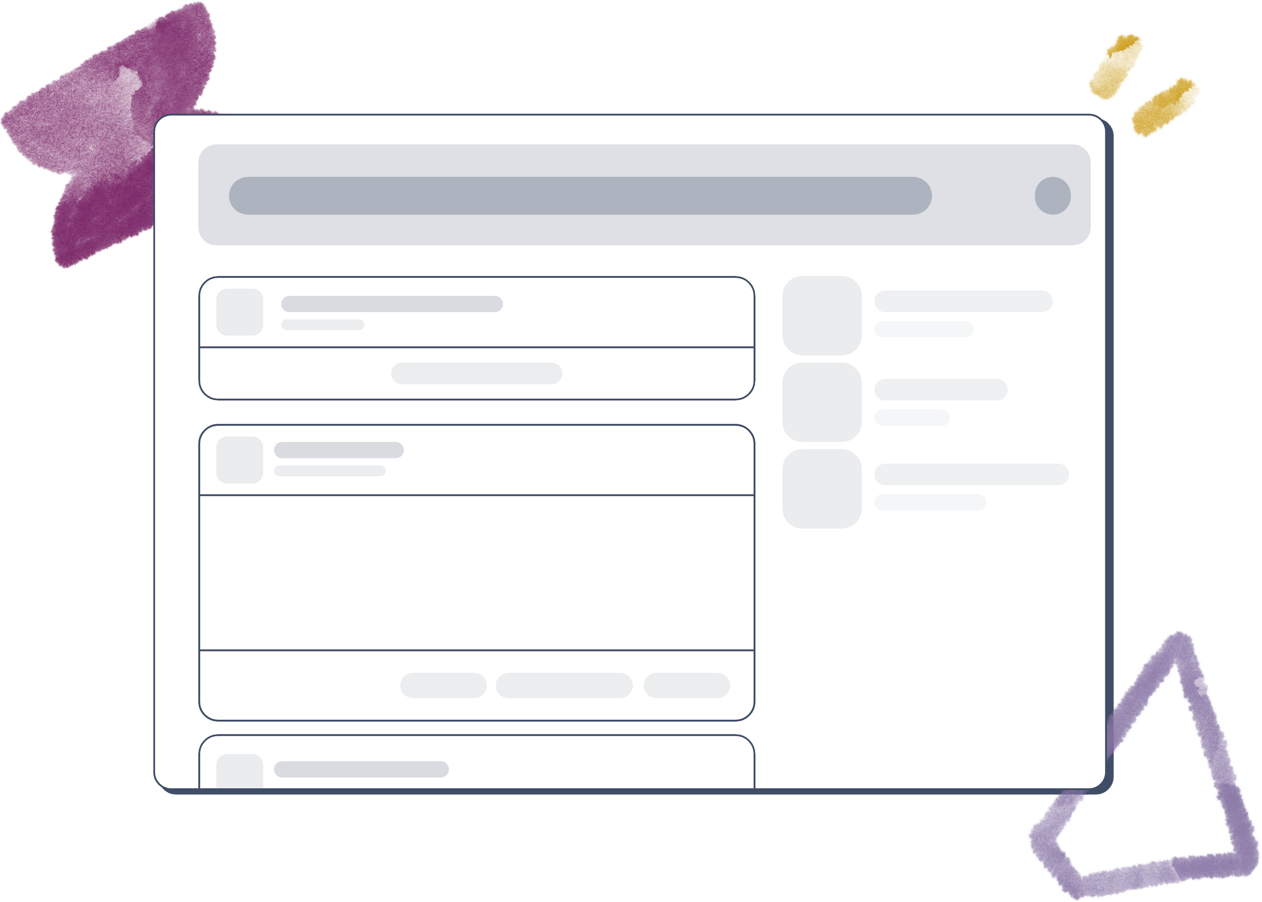
Maximizing data quality for a strong network

Efficient matching instead of cluttered feed posts

Higher user retention through proactive profile maintenance
The goal: break this cycle through a structure that visibly rewards data maintenance and immediately delivers what searchers need.
Strategic Goals
Efficient matching instead of cluttered feed posts. Scannable information structure for searchers. Proactive guidance for profile owners. Visual consistency between individual profile and search result.
Motivate users to maintain their data through smart UX elements

Speed up the process for members through scannable information

Create visual consistency between individual profile and search
Research & Validation
Before designing anything, I wanted to understand whether the problem was rooted in user motivation or in the structure of the platform.
Quantitative Survey
46 Users 78% confirmed that maintaining their profile felt too effortful. This pointed to a structural problem, not a motivational one.
In-Depth Interviews
8 Filmmakers Every participant had actively overlooked content in the tab sections. Not because they were inattentive, but because the navigation encouraged them to stay at the first visible block.
Core Insight: The problem was not the will of the users. It was an architecture that hid important content behind clicks.
My Assumptions vs. Reality
This table was the turning point in the process. One of my assumptions, that users are generally too lazy to maintain their profiles, turned out to be wrong. That shifted the entire design direction away from motivation mechanics and toward structural clarity.
| Assumption | Check | Result / Insight |
|---|---|---|
| Tab Structure as Barrier: Clicks prevent data input. | ✅ | Content in sub-tabs was almost never actively noticed. |
| Visual First: Large images matter more than text. | ✅ | Searchers skip profiles without visual anchors immediately. |
| Psychological Goal: Progress bars motivate. | ✅ | Without a feedback loop (banner), users lacked a sense of direction. |
| Cognitive Load: Consistent headers speed up search. | ✅ | Aligning search and profile reduces decision time. |
| Scannability: Tags beat prose for facts. | ✅ | Languages and skills are absorbed significantly faster as tags. |
| Motivation: Users are generally too lazy. | ❌ | The problem was unclear structure, not the will of the users. |
The Solution
Three interventions, one goal: make relevant information immediately visible.
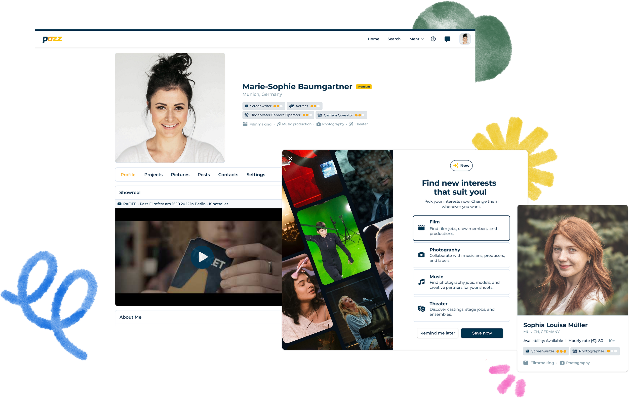
Content Unlocked
"Activities", "Appearance" and "Images" were moved out of hidden tabs directly into the main profile view, accessible without a single click.
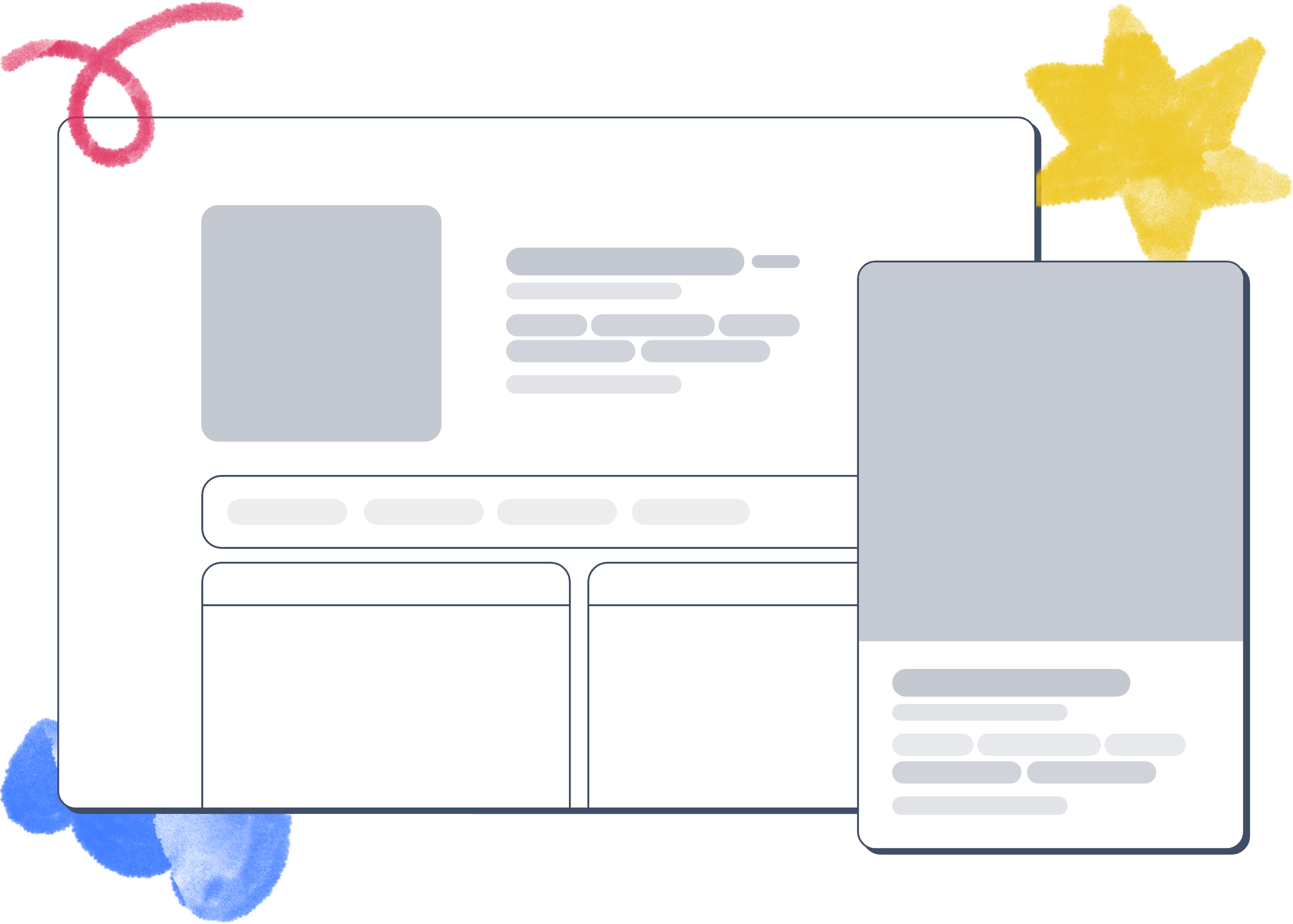
Unified Header
The profile header was visually synchronized with the search profile header. Searchers instantly recognize the pattern, less cognitive load, faster decisions.
Proactive Guidance
An info banner gives profile owners concrete hints about missing content, visible but not intrusive. The profile owner immediately understands what is missing and why it matters.
Business Impact
The redesign addressed a measurable pain point: 78% of users found profile maintenance too effortful. By dissolving the tab silos, introducing the unified header and adding the proactive banner, profiles could for the first time reliably serve as a matching foundation.
A targeted relaunch communication reactivated existing users who actively updated their profiles. Post-launch tracking was not implemented at this stage. Defined KPIs for the next iteration: profile completion rate, time spent on profile pages, conversion from profile visit to contact request.
Key Learnings
Structure beats motivation. The assumption that users are lazy is almost always wrong. Most of the time the interface is at fault, not the person using it.
Feedback loops are not a nice-to-have. Without a visible response to data maintenance, users have no reason to continue. The banner was not an aesthetic element, it was the missing connection between effort and outcome.
And personally: Post-launch tracking needs to be part of the process from the beginning, not an afterthought.